Let's join forces and
create clarity in your comms
create clarity in your comms
Send me a quick note with the job your digital presence needs to do, and where it’s falling short. We'll take it from there.
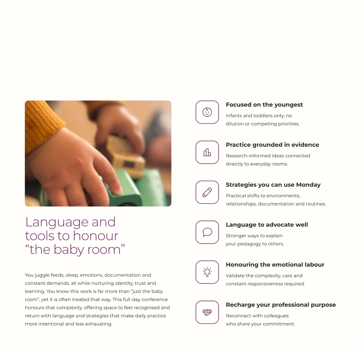
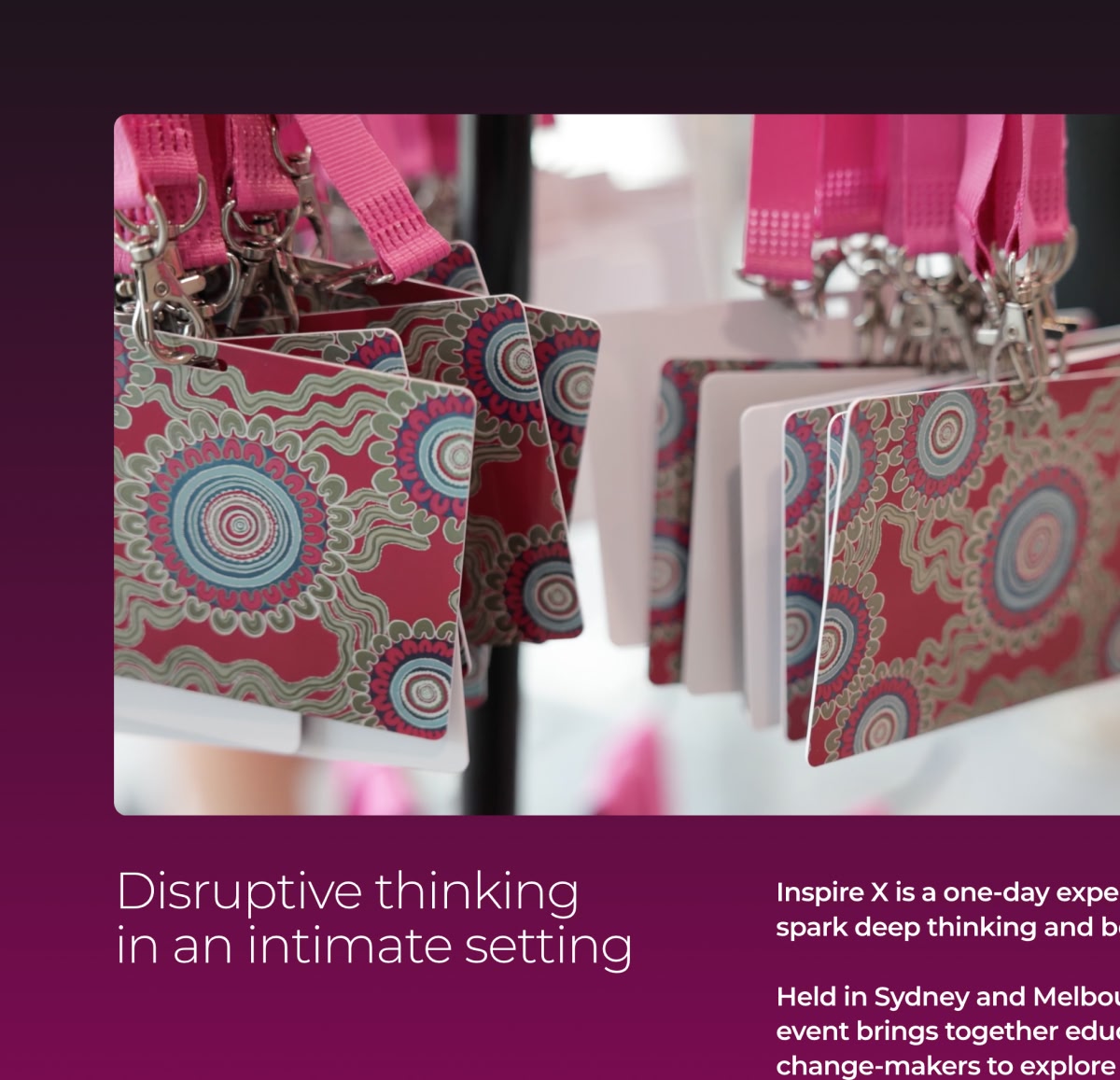
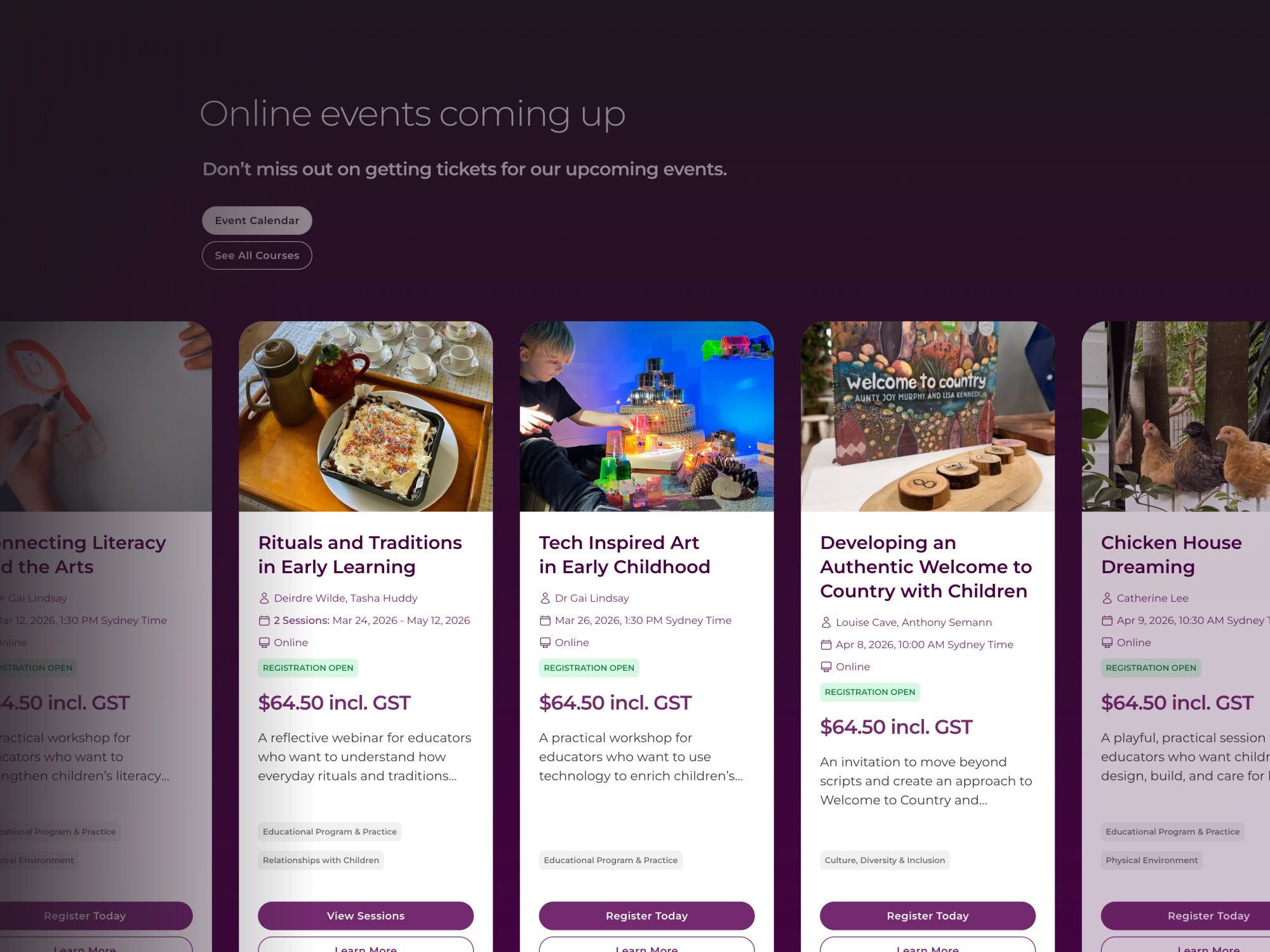
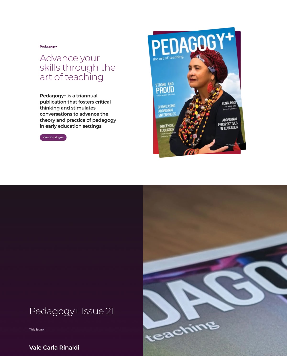
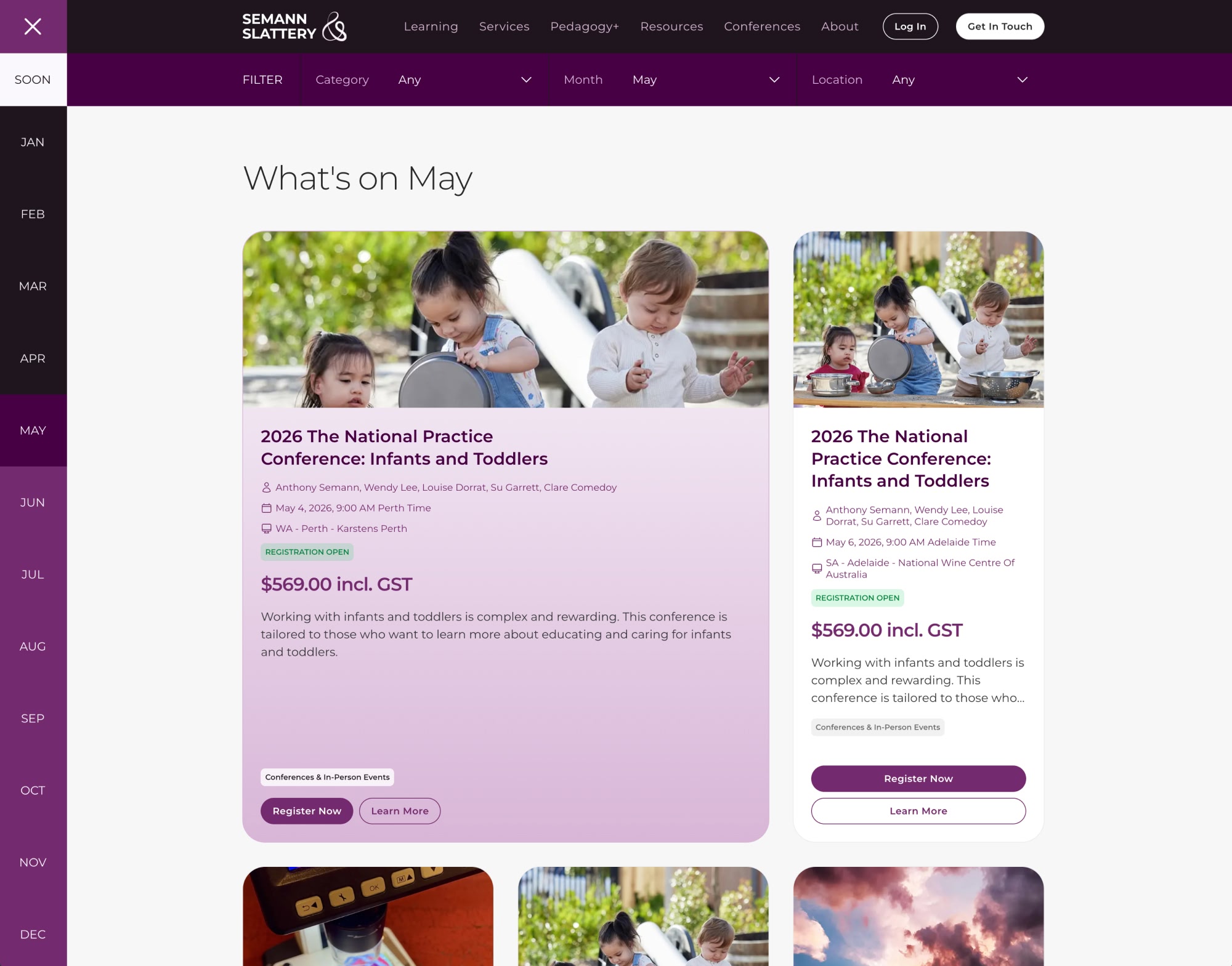
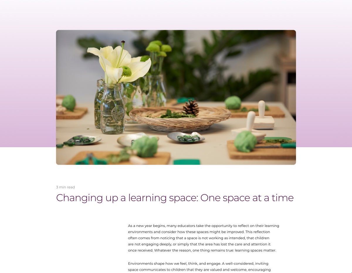
When someone lands on the Semann & Slattery site, they want to quickly find a webinar, workshop, conference, coaching option or free resource that fits their situation, without clicking in circles or second‑guessing themselves. The new site is designed to guide them straight to what they need and give them confidence they are in the right place.
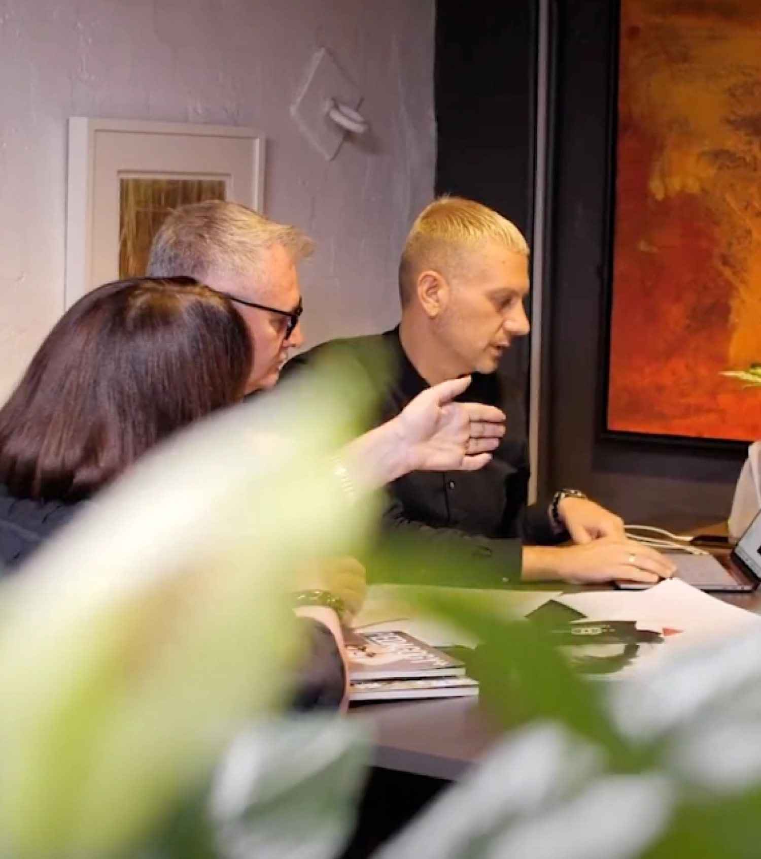
Over nine months, we moved through discovery, planning, design, build and testing, partnering with Brisbane development studio Fluent to bring the new site to life.
Every decision was anchored in real scenarios like “I need a leadership webinar this term” or “I want a practical article I can share with my team this week.”
The new site has been warmly received by Semann & Slattery and their customers, with clearer navigation and a much stronger sense of who they are and how they can help.
Next, we are planning AI‑powered search and customer support to make it even faster for visitors to move from “I have a question” to “I’ve found exactly what I need,” with every new feature shaped by real customer needs.