Let's join forces and
create clarity in your comms
create clarity in your comms
Send me a quick note with the job your digital presence needs to do, and where it’s falling short. We'll take it from there.


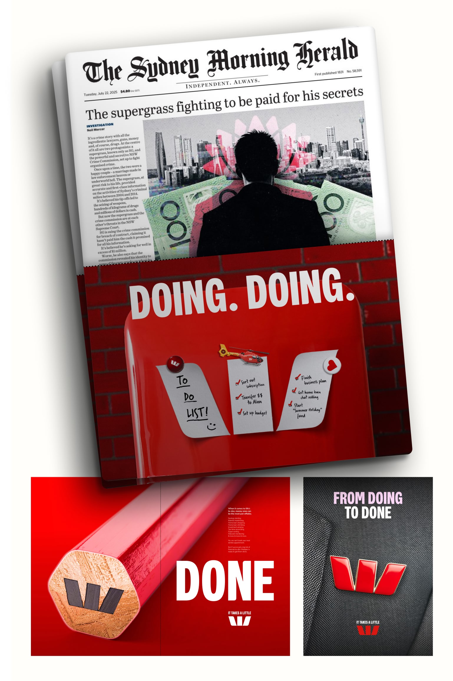
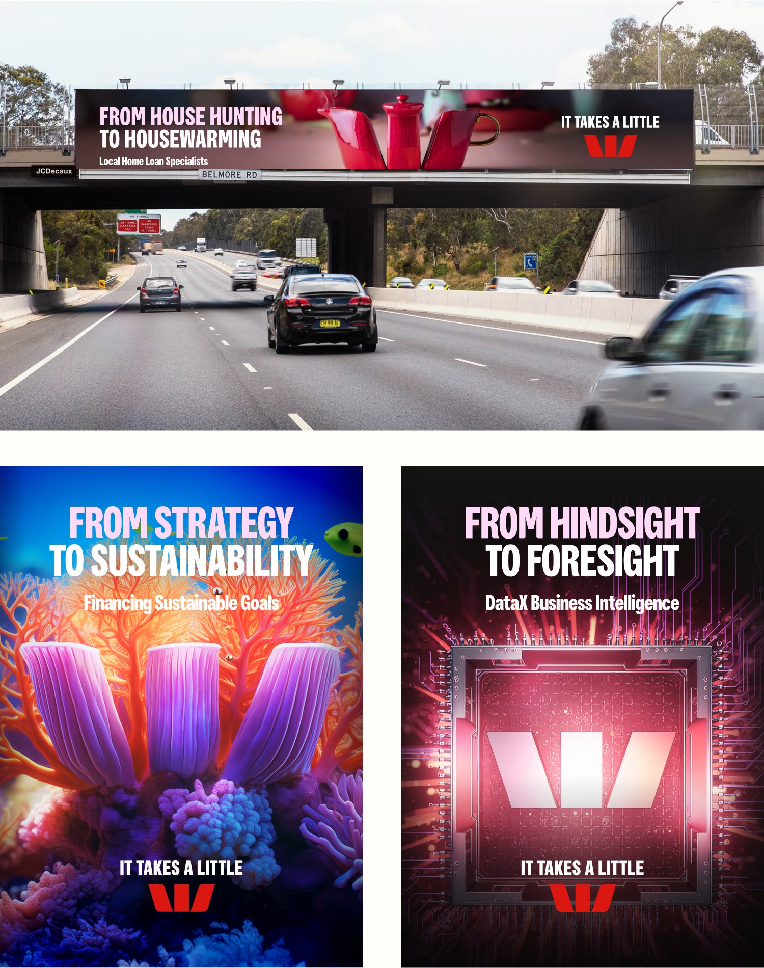
Westpac wanted a brand launch that did more than just “look great”, it needed to make the W impossible to miss and clearly linked to the many ways Westpac supports Australians and businesses. In practice, that meant turning the W into vivid, real‑world scenes across different products and industries, so people could instantly connect the symbol they already knew with the services they might actually need.
We started by treating the W as a flexible building block that could be reshaped into hundreds of different scenarios, each reflecting a product, customer moment or industry vertical. Using AI tools such as Adobe Firefly and Runway alongside Adobe Photoshop and Figma, we explored, refined and produced a wide range of creative executions at speed.
These W‑led visuals were then rolled out across a national launch: press, out‑of‑home, digital, social, sponsorship and more, creating a joined‑up experience wherever people encountered the brand. As we worked, we also helped shape practical workflows for Westpac’s in‑house teams and partner agencies, training them on how to brief, create and refine AI‑supported concepts in a safe, consistent way.
The campaign strengthened Westpac’s already powerful red W as a distinctive symbol, contributing to gains in brand recognition and keeping Westpac top of mind when Australians consider banking and financial services. By pushing the W into rich, contextual stories, the work helped bridge the gap between a familiar logo and the real‑world moments where people need support from their bank.
Creatively, the project proved how AI tools can be used responsibly to move faster without losing craft, and it gave Westpac’s in‑house agency a repeatable way to experiment and scale new ideas. Along the way, the team sharpened the balance between using a bold symbol and delivering a clear message, learning where a striking W was enough on its own and where it needed stronger copy and context to drive action.